mid-century quirk
Question: Who in their right mind would tackle a fixer during a pandemic?
Answer: A very brave family who had no idea the world was going to completely shut down two weeks after close of escrow.
This 1972 home was a sight to see when my clients took the fixer plunge. Swag lights and giant low-hanging chandeliers, broken windows, no heat to speak of, a leaking second-floor bathtub, holes in the walls, mysterious smells...it was the fixer of all fixers. A lime green living room with a massive dark stone fireplace, a dark purple stairwell with a chocolate brown ceiling, bedrooms painted dark red and dark blue. Layer upon layer of wallpaper was peeling off the walls: yellow ostrich skin pattern on the entry ceiling, red cabbage roses in the kitchen, lime green ‘70s toile in the first bathroom, water-damaged beige ditsy florals in another, and decoupaged pages from a book about species of birds covered the walls in the third. Furniture, books, and knick-knacks were everywhere. Once upon a time, this house had been LOVED by its owners, but it was definitely time for a slew of updates.
Five months and one pandemic later, it’s a stunner - colorful and quirky, a perfect reflection of the owners’ wonderful personalities. Check out the before and after images at the bottom of this page, and prepare to pick your jaw up off the floor afterward!
the big reveal
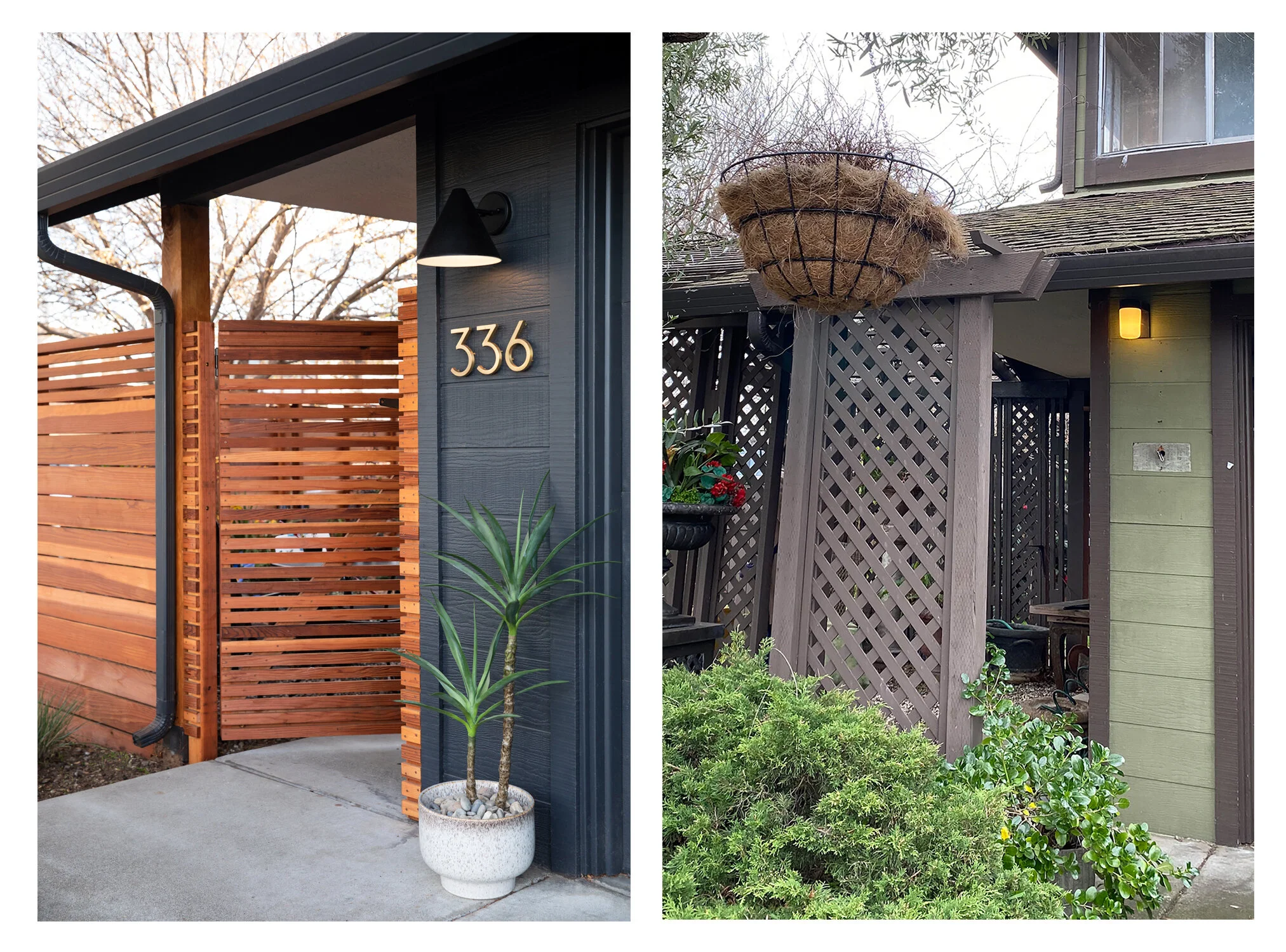
When we first toured this fixer property, you could barely see the house from the street. There was a massive latticed pergola with saloon-style doors obscuring most of the home’s olive and brown facade. It was covered in dead vines, and what was left of the yard was filled with shards of forgotten pottery, a multitude of statuary and faux flower bouquets.
Needless to say, the pergola was the first thing to go - and once it was gone, a trio of original amber bottle glass windows revealed themselves in the entry area. Score!
make it pop
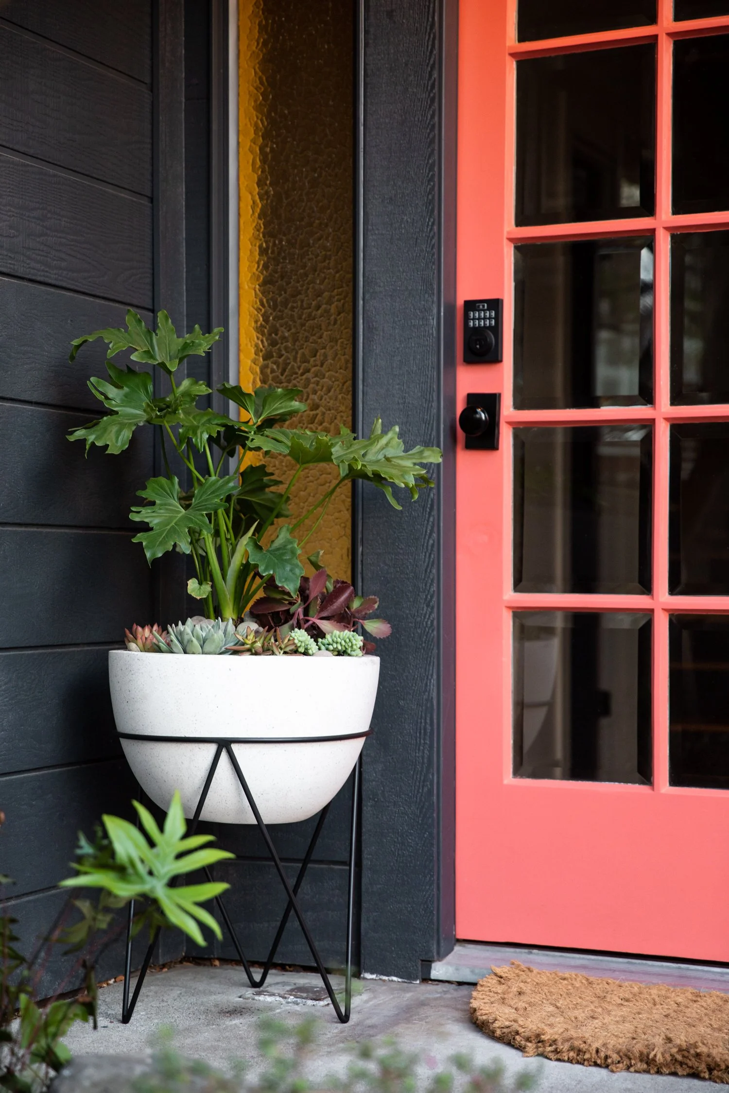
The beautiful solid wood front door with thick beveled glass insets needed a bit of restoration work, but when the first coat of coral paint went on we KNEW it had been worth the rescue effort. The interior entry area gets bathed in sunlight much of the day, and the perfect shade of soft pink graces the interior side of the door.
welcome home
The entryway was covered in vertical paneling, heavy decorative trim and low-hanging chandeliers when we first saw it. A clean slate with fresh flooring and recessed lighting makes the space feel so much larger, the perfect spot for all those last minute “get the kids out the door” activities.
lite brite
We were so excited to discover another original amber glass window behind the wall paneling! I love how the sunny color pairs with the soft pink of the door, which matches the walls of the adjacent powder bath.
block it in
To keep things exciting without adding cost, we played with color blocking paint colors at the ceiling and trim. The ceiling is a perfect match to the floor tile color, and the crown molding and plate rail coordinate with the entry door and fixtures. A classic 70’s-inspired ceiling light provides plenty of ambience while winking at the home’s origin year.
sleek + light
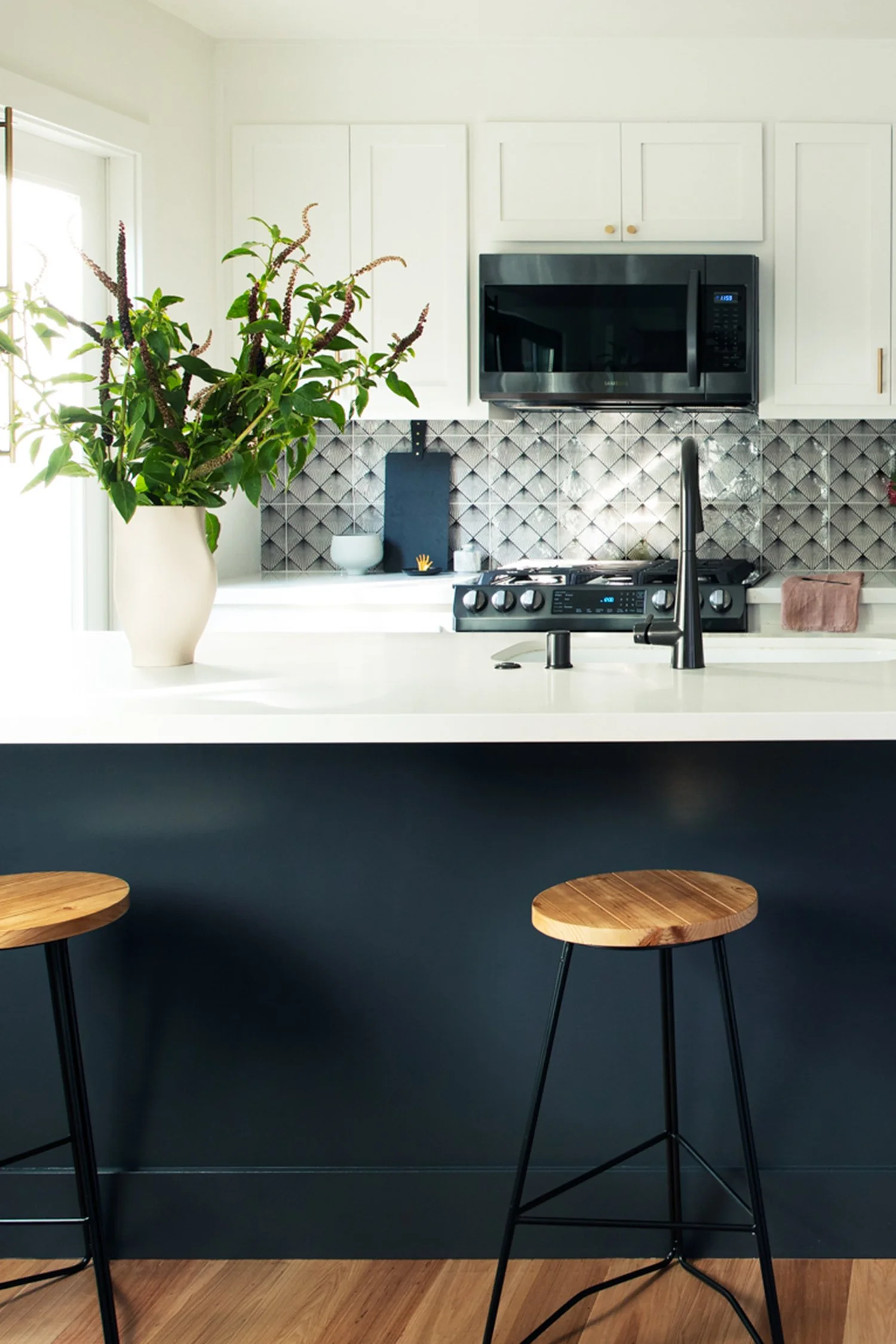
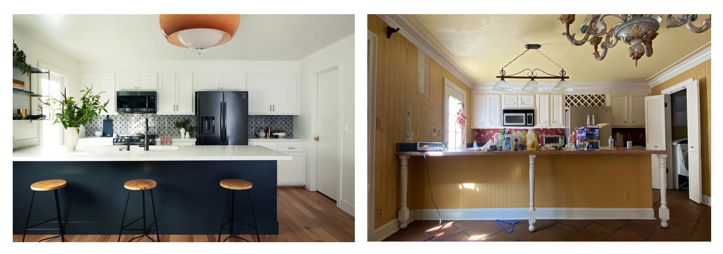
In the kitchen, a patterned backsplash, dark island, and sleek black stainless steel appliances ground an otherwise light and bright open space.
New cabinet doors with soft close hinges and brass hardware helped revive the original cabinets, while removing all the decorative moldings, trim, and island legs helped lighten up the overall feel.
going up
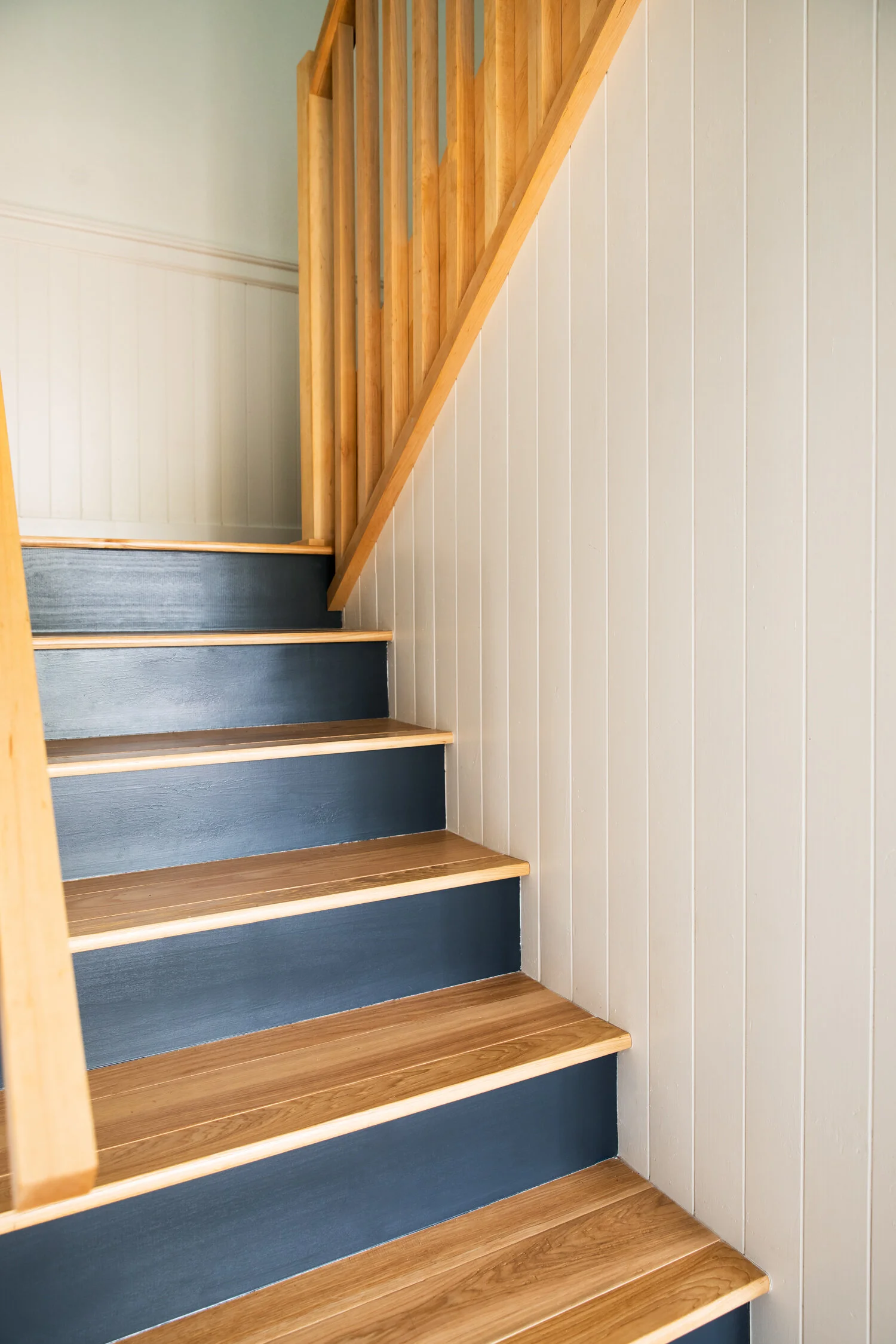
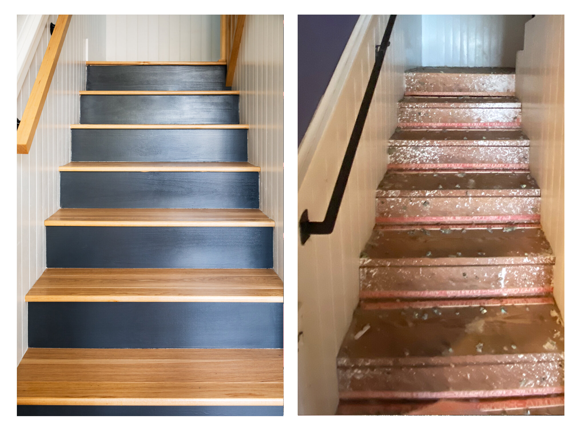
This staircase was screaming “danger” when we first saw it - plywood treads with exposed carpet tacks, and a dated railing that was too short for adults and too spaced out for the kids’ safety.
Now, fresh treads and new painted risers give way to a beautiful custom hickory stair railing that’s safe and secure.
minty fresh
This killer mint green bathtub is one of the only original fixtures that was allowed to stay. We refreshed the shower surround with clean white tile and gave the tub new life with beautiful brass fixtures. The floors got a pretty and practical upgrade via commercial-grade vinyl sheeting with a subtle terrazzo pattern.
work what you’ve got
Budgeting for a large-scale renovation project is a little like managing a very long line of falling dominos, each piece with its own associated cost that will affect the next domino in line.
One big decision my clients made early on was to work with the existing cabinetry in the house, making modifications where necessary. Keeping the cabinets meant leaving the plumbing where it was, which also helped keep the budget down. In a new build, I would have centered the sink on the mirror - but here the offset placement adds to the charm of the room, in addition to helping my clients meet their budget goals.

moody blues
We’d been discussing adding a skylight or sun tunnel to give the primary bath some natural light when my client came upon this arched deco-inspired wallpaper. She fell in love - and with that, we decided to embrace the room as is, leaning into a dark and moody vibe.
An extra-long vanity mirror reflects light to make the space feel larger, and the shape of the vanity lights perfectly compliment the wallpaper design.
full immersion
Brass water fixtures adorn a full-surround midnight blue tiled shower with dual shower heads (wall + ceiling), frameless glass enclosure, and a large storage niche in the adjacent pony wall.
before + after
The 'after’ photos from this renovation take on an entirely new level of meaning when you see them next to the ‘before’ photos:


