craftsman kitchen refresh
No doubt about it - kitchens are the hardworking heroes of the home. They can also be the most expensive spaces to renovate, but a small budget shouldn’t stop you from creating a kitchen that’s functional and beautiful. Here, we completely transformed the space with a few key placement changes and finish upgrades.
Photos by Joy Coakley
olive to the rescue
When working with a small budget, the first questions we ask are “What works? What can we keep?” and “What absolutely has to change?”
Here, the countertops were lovely and in excellent condition. The lower cabinets, while worn on the surface, were solid wood and the layout worked well. A coat of olive paint, new hardware, and a fresh drop-in sink with new faucet and disposal did wonders to revive the existing finishes.
subtle shifts
Before the transformation, the upper cabinets in this kitchen featured an awkward corner and just barely too much width to accommodate the space where the refrigerator should have been. As a result, the range was swimming in wasted space, while the refrigerator jutted out awkwardly into the room. Replacing the upper cabinets with taller, narrower cabinets not only allowed the appliances to relocate to their rightful places, it gave the owners more storage space.
Since the new cabinets featured a slightly different profile than the existing lower cabinets, we chose a two-tone color scheme with dark lower and light upper cabinets. White uppers also help the small space feel larger and the modern profile helps the kitchen feel updated.
luxe shelves
I know, I know - everyone has an opinion about open shelves. Love them or hate them, they have so much potential to open up and beautify a kitchen. Here, we replaced a single wall cabinet with two shelves. Not only does the countertop prep area feel larger, the combination of marble, brass, and special kitchen items add a luxe feel to the space.
add a splash
Those who know me have heard me exclaim “Tile the world!” at least once, if not a few times. I love the way tile can add depth, texture, color, and pattern to a space.
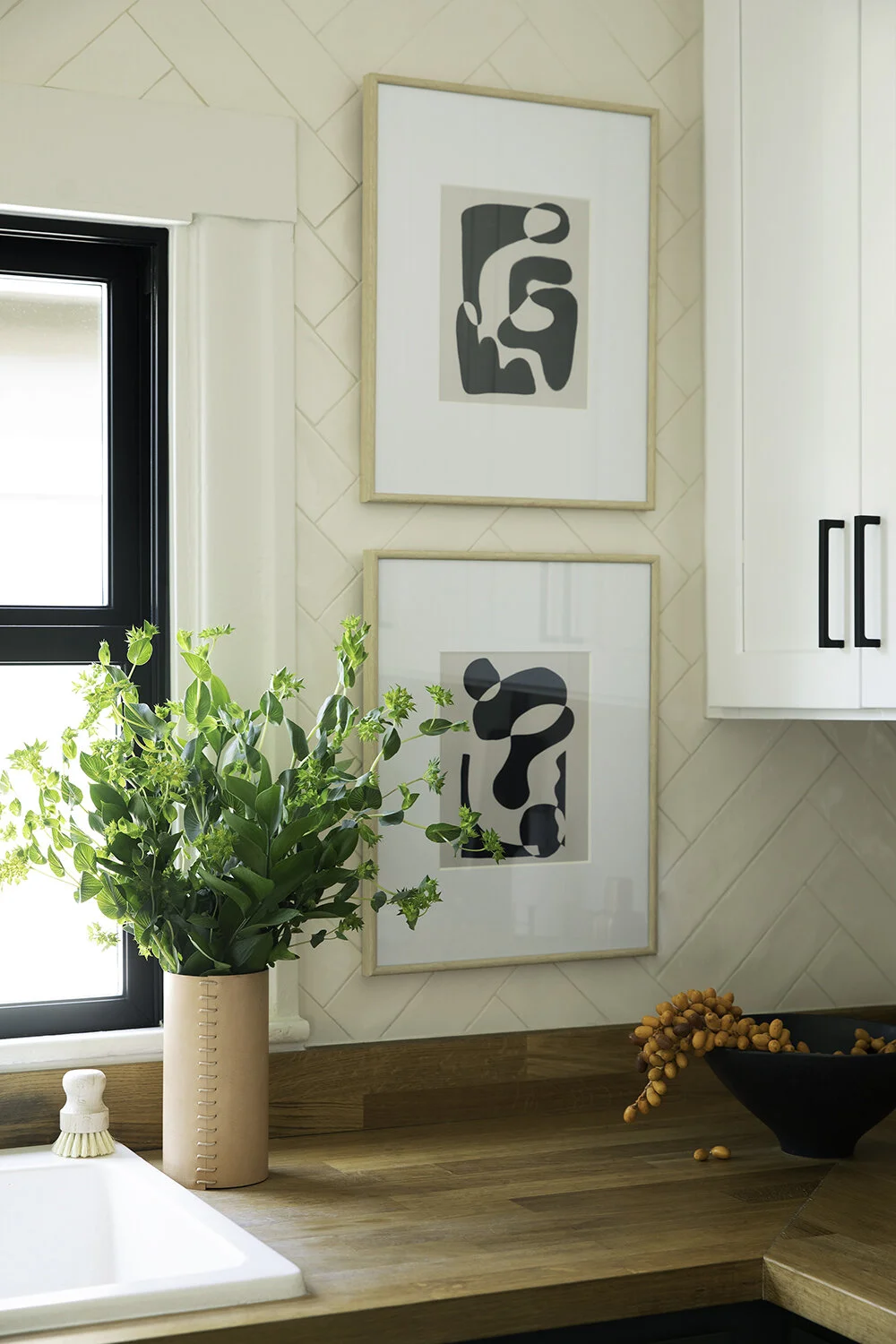
Here, we added a cream herringbone backsplash from the countertop to the plate rail, adding warmth and texture while protecting the walls from inevitable splatters.
in good company
Historic homes, while loaded with character, often come with interesting quirks to work around. Traditional base cabinets didn’t work in this corner due to the low placement of the window and built-in china cabinet.
A window seat and small bistro table fit perfectly in this otherwise tough-to-utilize space. The bench is upholstered with kitchen-friendly vinyl, while the black marble table adds another beautiful textural element. Colorful cushions provide a soft corner and invite family members to spend time with the chef.


