oakmore arches
Our client was looking to turn her 1935 Mediterranean style home into a peaceful sanctuary that felt clean, light, and feminine. With arches featured prominently throughout the interior and exterior of the historic home, it felt right to weave more of that form throughout the home. Soft warm neutrals with undertones of blush, eased edges, and brass accents mix with bold tile selections and eclectic art to give the space a dose of modernity
Photos by Margaret Austin
soft landing
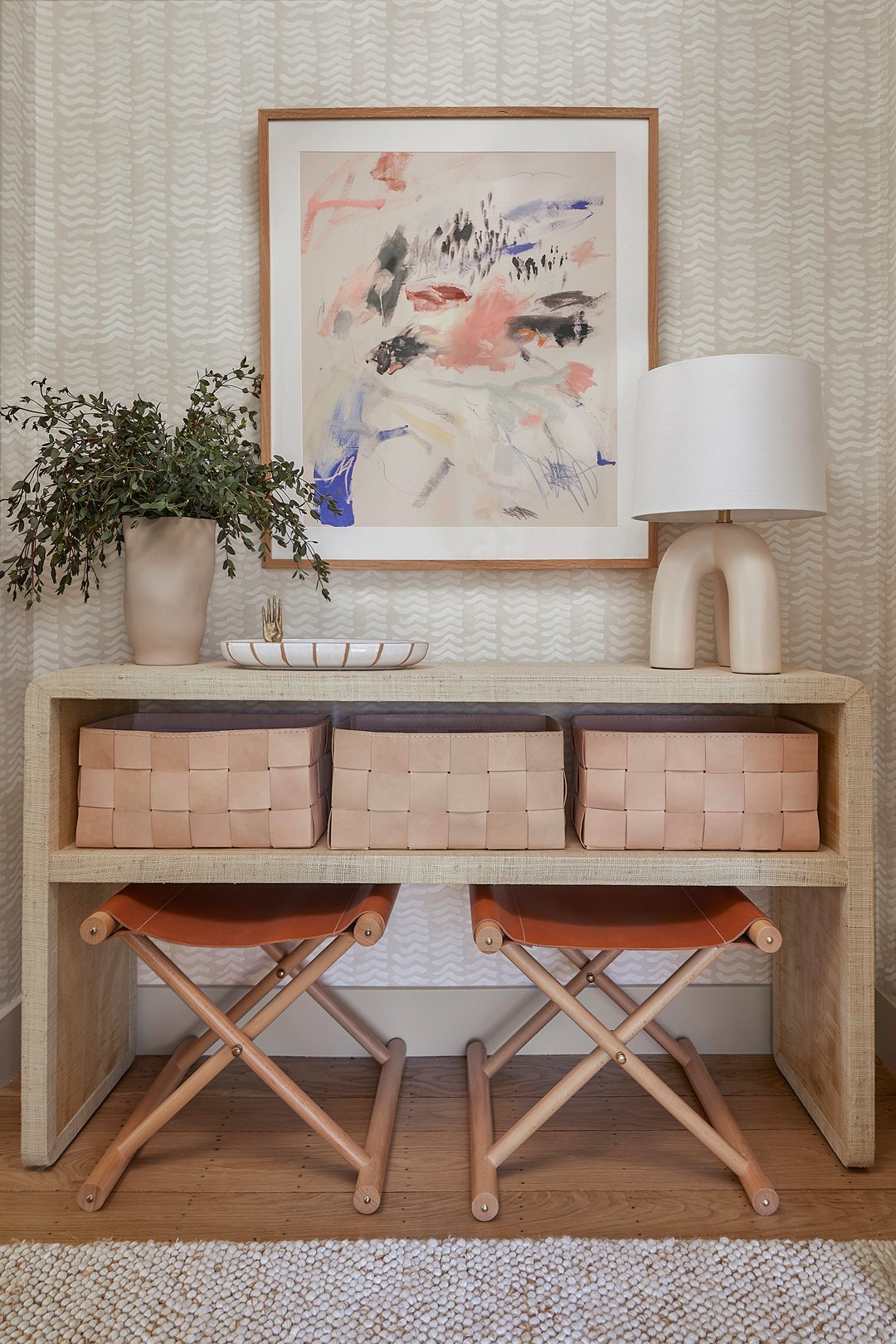
Walking through your front door after a long day should feel like a warm hug. In this case, it’s a warm, textural, inviting hug with soft lighting, chic art, and leather baskets to stash all your stuff.
This wall was once the entrance to the kitchen…scroll on to see where we put the new opening.
at the bar
Breakfast bar or cocktail bar? The answer is clearly both. We hid extra-deep storage above and below the counter seating area, making the most of an awkward corner and lengthening the workspace area near the kitchen sink.
This arch did not exist prior to the renovation, which is hard to imagine now that it’s here! This important change to the floor plan created a beautiful double-arch focal wall in the living room, a true formal entryway, and more storage in the kitchen. Sight lines from both the living room and kitchen also improved significantly.
work the layout
While replacing all the finishes and fixtures goes a very long way, the structural changes we made to this kitchen are the heart of why the renovation was successful. We closed off a doorway, widened an existing arched opening and added a second, and re-shaped another existing arch. Meanwhile, the new cabinetry layout provides both counter seating and smarter storage, creating a better flow for both cooking and conversation.
custom wins
Many of the details in this kitchen would not have been possible without custom cabinetry and the work of expert tradespeople to bring it all together. Case in point: notice how there are two perfect rows of arched tile underneath the upper cabinets (and exactly three above the range)? Clean as a whistle. Let’s also take a moment for the perfect curve on the custom range hood…these are the small details that really make a space sing.
plus one
…foot, that is. We were able to capture a good deal of additional ceiling height once the original drywall came down, creating more storage and a sense of openness in the room.
The counter-to-ceiling pantry cabinets act as an appliance garage, hiding away the microwave and other small appliances.
showing off
Dishes, glassware, cookbooks, a favorite vintage find or two … open shelves always provide the perfect way to display the prettiest of all the functional items in the kitchen.
panel pretty
When the budget allows, panel-ready appliances are at the top of my list to improve the overall look of a kitchen. IMO, the most beautiful refrigerator is one that does not look like a refrigerator! We also tucked a full-height broom closet into the corner, which stores a step-stool so the owner can easily access the upper cabinets.
This home had beautiful historic mixed-width pegged hardwood floors, which our contractor meticulously matched in the kitchen. They add so much beauty to the space.
double down
The main floor bath was formerly a smaller space with a single pedestal sink, cave-like shower stall, low tub, and sad tile situation. We stole some dead space from the adjacent hallway and reworked the floor plan to allow for double sinks, a generous shower, and a linen closet.
A custom vanity with deep drawers and arched medicine cabinets provide plenty of storage for the two teenagers who use this space every day.
spa blues
The bathroom generally reads light and bright, but this dose of blue in the shower keeps it interesting and makes for an energizing morning scrub. Terrazzo floors with terracotta accents and brass plumbing fixtures create continuity with the rest of the main floor.
a job well done
A round of applause for the tile installer on this one, folks - this kind of symmetry is not easy to achieve! I love to design special details like this, but at the end of the day the final product is a direct result of the team of tradespeople executing the vision.


